Our font libraries are filled with hundreds of them. There are the classics that we all love and will always go back to after a long search of a fresh one. Every once in awhile a new one will become trendy and appear everywhere until we all fatigue from it. Typographic masters have created timeless designs that have been refined and adapted from outdated to newer technologies over decades. So you must be asking yourself: do we really need another sans-serif typeface? The answer is probably no. We don’t need another typeface like that, mostly because these typefaces are hard to beat.


Newline really started as a personal experiment. Having studied typography and playing around with designing some initial typefaces, I wanted to create a real, working family. So I opened Glyphs for the very first time and started drawing. It was clear to me that I'm going to create a geometric sans-serif with classical proportions.
My main goal with Newline was to create a typeface suitable for and based on current typesetting technology—a digital font. There are so many beautiful, well-crafted typefaces out there, some of which were designed specifically for our digital tools. However, the majority of them still follow the rules and constraints of metal typesetting techniques. Certain letterforms have been avoided because they weren’t compatible enough with other characters. Even though technology allows for new shapes to be utilized, new typefaces are still following the old constraints. Nowadays letters can automatically intersect, overlap, make room for one another, etc. much more easily than before. The variety of characters we can include in a typeface is virtually unlimited, yet most fonts still have one form for every character and a few ligatures.
The pursuit of creating harmonious relationships between characters has always been central to the craft of lettering. Of course, the notion of what is and isn’t harmonious has evolved with time and technique. Inscribers throughout two millennia have paid close attention to spacing and tried to resolve the irregularities between Roman capitals. Ligatures, custom forms and very generous letter spacing were deployed to achieve consistent rhythm. The Gothic letter—while less legible than its Roman predecessor—succeeded in creating a unified grid that characters found themselves onto resulting in the most perfect cadence. Calligraphers will alter their letters in context of other surrounding letters, not only to ensure continuous cursive script, but also to compensate for negative spacing. It is really the nature of metal type that created the extremely rigid, machine-grade rendition of letters on a page that we now take for granted.
The inscriber used a chisel to create the letter (after drawing it with a brush), which allowed complete customization for every instance of it. Calligraphers enjoy the same level of control as the inscriber. In conversation with Paul Shaw, I learned that some calligraphers connect their lowercase r and crossbar of lowercase t (rt) to avoid the large space under the r. Helmut Krone, the legendary DDB Art Director who created some of the most iconic ads of the ‘50s and ‘60s used to obsess over letter spacing. Jack Marriucci, my advertising teacher (himself an ad legend) was Krone’s assistant for many years. Krone used to make him chop the strokes of letters, even in body copy, to make sure they fit tightly with the next one.


Of course our digital fonts take care of kerning and provide standard ligatures, but very few of them alter individual letterforms based on neighboring letters with contextual substitution.
As our typographic tools advance, we become less accountable. That care that was once taken (since the chisel and through photosetting) to each and every letter has been lost. We now expect the computer to do more and more of the stuff our hands and brain did so meticulously. When we type our headlines, let alone body copy, the output is so immediate that we barely touch and manipulate our individual letters. While I don’t think we can replace craft with automation, we can make certain things easier.


The letter forms themselves, their proportions and serifs (or lack thereof) are obviously the most fundamental aspects of a typeface which define its personality. The cohesiveness of the typeface comes from recurring shapes and the relationship between positive and negative space. So my biggest question was: can I create a cohesive, geometric sans-serif typeface with letters that adapt themselves to each other just as well as the inscriber, calligrapher or obsessing art-director would do manually?
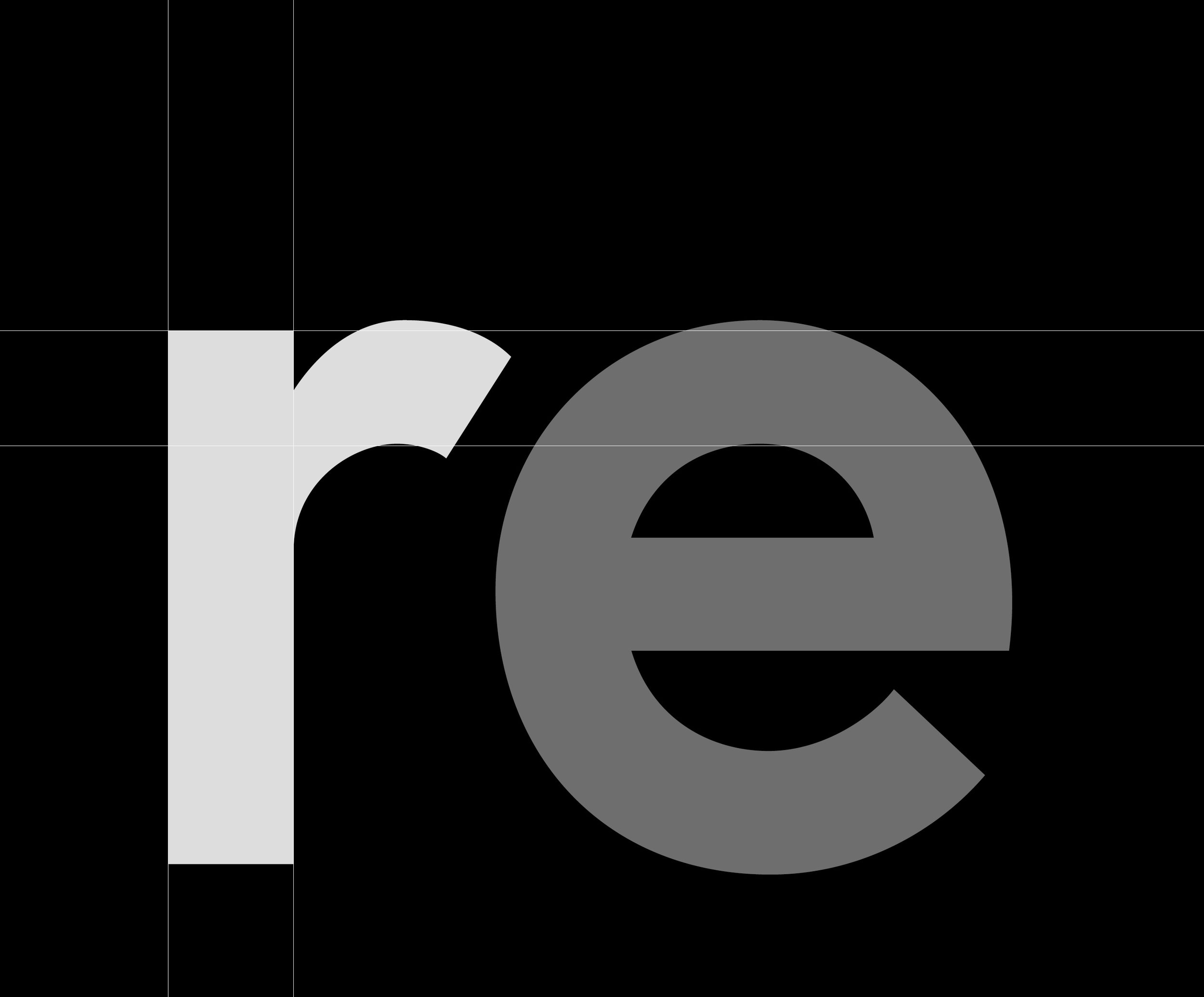
Why should ra and ri have the same lowercase r. And why would that lowercase r be the same when paired with a lowercase f and t? Why should combinations fg and fk have the same lowercase f? Why should lowercase r and e be followed by the same question mark? Why would the uppercase R be the same for RA and RY? When you deal with metal, there are obvious reasons, but when you don’t the only reason is convention. Like I said, there are many lettering techniques that would practice (and be admired) for that customization. I knew I wanted to create a geometric sans-serif, but the spectrum of letterforms are the result of trying to fix specific issues that I found less pleasing in existing typefaces.
Lowercase t is the best way to describe Newline’s approach for crossbars and terminals, since it requires customization on both the left and right side. In certain cases space needs to be condensed on the left side of the letter (when placed next to lowercase r), in some cases the terminal juxtaposed with the letter on the right works better curved in others as flat.


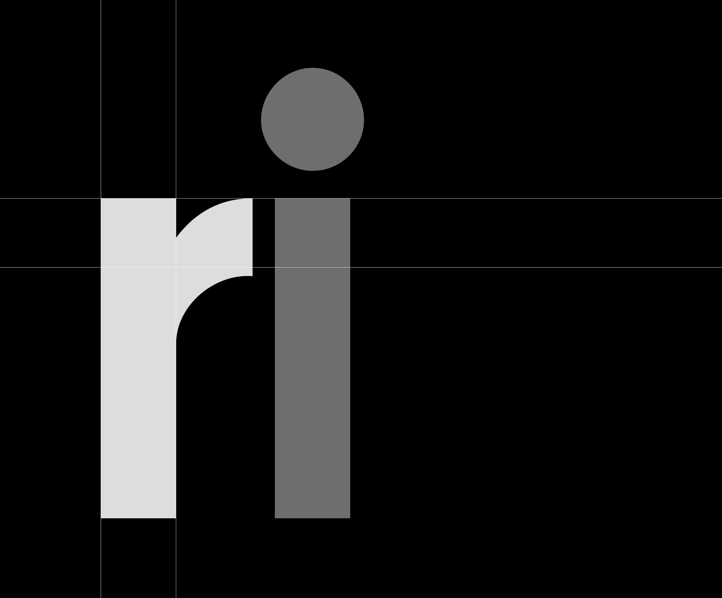
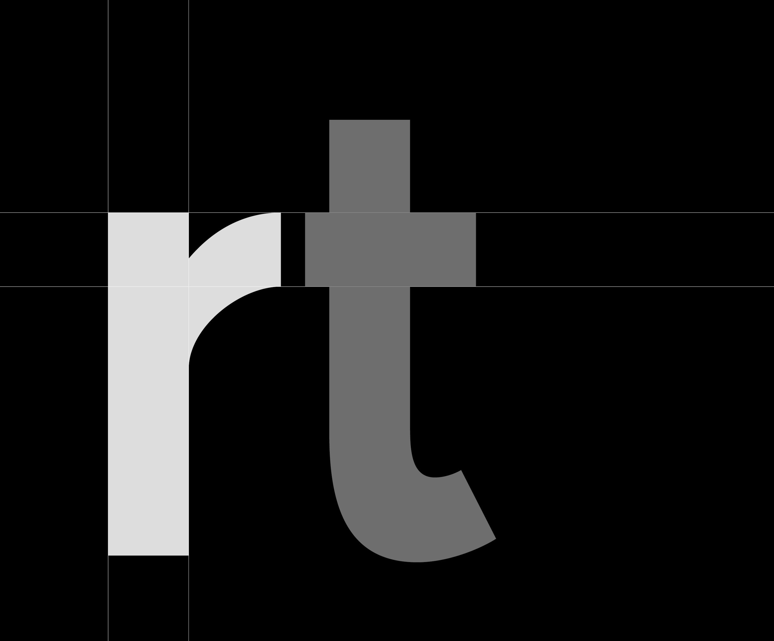
The lowercase r adjusts based on the following letter. Because rounded letters can be closer to it, there's an opportunity for it to be slightly wider and continue the curve further down. However, it is narrower and cut to fit tightly with straight characters. Next to lowercase r and f it is modified to match the exact height of their crossbars, while becoming only slightly wider for legibility (the crossbar, therefore becomes shorter on the left).
The lowercase x breaks consistency with its usual v, w and y counterparts, which are cut off at the baseline and x-height. Instead, its stroke ends are treated like the terminals of round forms. While I do realize this is an unusual decision, it felt like this choice contributed to the geometric and straightforward personality of Newline. There is an alt glyph for those who prefer using a more conventional x.

This is Newline rendered on a browser. Notice that the ligatures and contextuals available in the OpenType version are supported.


Building a font with contextual alternates as its backbone (and not an afterthought) hopefully results in a different kind of typeface. One that doesn’t rely on the repetition of exact character forms, but rather a spectrum of forms that work as a whole. It is similar to Avant Garde in its attempt to create an even rhythm between negative and positive space, but in a less graphic and stylized manner. Many more alternates were explored but eventually removed because they broke the cohesiveness of the typeface. I tried my very best to solve the ry issue, but decided to not include it as a standard contextual—it was simply too distracting. However, the y alternates are included in the font.
As a side note: I do realize that I’m not the first person to have attempted this, but none of the fonts that I encountered did this in the way I wanted it to work.


As suspected, this geometric approach serves better for headlines and not so much for small type. Of course, letters need to be different for different sizes; this was an inevitable part of creating metal type as glyphs would be slightly adjusted for the specific manufacturing size. Unfortunately, it’s no longer the case with our digital fonts. Relatively few of them feature different versions that are adjusted for different sizes.


While the approach of aligning crossbars, tightening spaces and interlocking specific forms works well for bigger type, it is less suitable for body size. Which is why I created two different iterations—one for headlines and one for text. The headline version (simply Newline) features more geometric, single-width strokes with very little compensation in stroke intersections. The text version (Newline Text) has greater contrast in stroke weight to increase legibility and create overall color consistency in small size. The dot size (and therefore punctuation size and accents) is slightly bigger for lighter weights in the Text version. In contrary to the above example, Newline Text actually has wider side bearings to ensure legibility and comfortable spacing.
Stylistically, Newline was inspired by the geometric simplicity and classical proportions of Futura, and borrows from the legibility and letterforms of humanist typefaces such as Akzidenz Grotesk. Like all typefaces, it is difficult to explain in words the attitude and tone of Newline—those will be created through context and time.